On Wednesday morning, the 90-year-old franchise formerly known as the Boston Braves (1932), Boston Redskins (1933-1936), Washington Redskins (1937-2019) and Washington Football Team (2020-2021) unveiled its newest identity.
After an 18-month process, the local NFL team will be called the Washington Commanders.
As someone who keeps a close eye on new professional sports logos and uniforms, I naturally have some thoughts on this rebrand.
I get that the organization is trying to modernize in terms of uniform design and numerals but I typically like uniforms simple, especially with heritage franchises like Washington. I’m not that big of a fan of them getting as cute as they did trying to modernize their look but they turned out better than the leaks that came out Tuesday had portrayed. But honestly, they could’ve kept their old uniforms and it would’ve been perfectly fine. This is a classic NFL franchise and it should look like it.
Here’s my super-scientific breakdown of each portion of their new identity:
THE NAME
- Commanders is a “meh” name. Choosing Commanders comes across as the team simply settling for the best of the most acquirable names. Three of the early fan favorites – Warriors, Redwolves and Wolves – were eliminated during the process, tamping expectations among the fan base.
- It’s also going to be strange with Washington’s nickname sharing the first two letters of its biggest rival, the Dallas Cowboys.
THE LOGOS

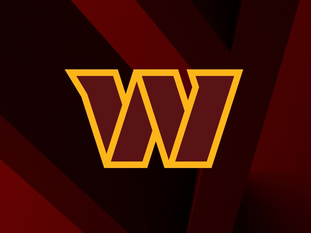
- The primary W is almost an optical illusion. When I look at it, I can see two different Ws and I don’t like that. The logo that I like is a solid, bold, stenciled W. The other is either a taco holder or cards leaning against each other. I feel like that will constantly play a trick on me. I get the idea of going with a military stencil theme, but it’s still a downgrade from the previous W. Despite the downgrade, it’s still a respectable logo. 3.5/5
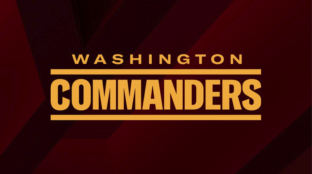
- The Commanders wordmark is a simple, solid look befitting the team’s military theme. 4.5/5
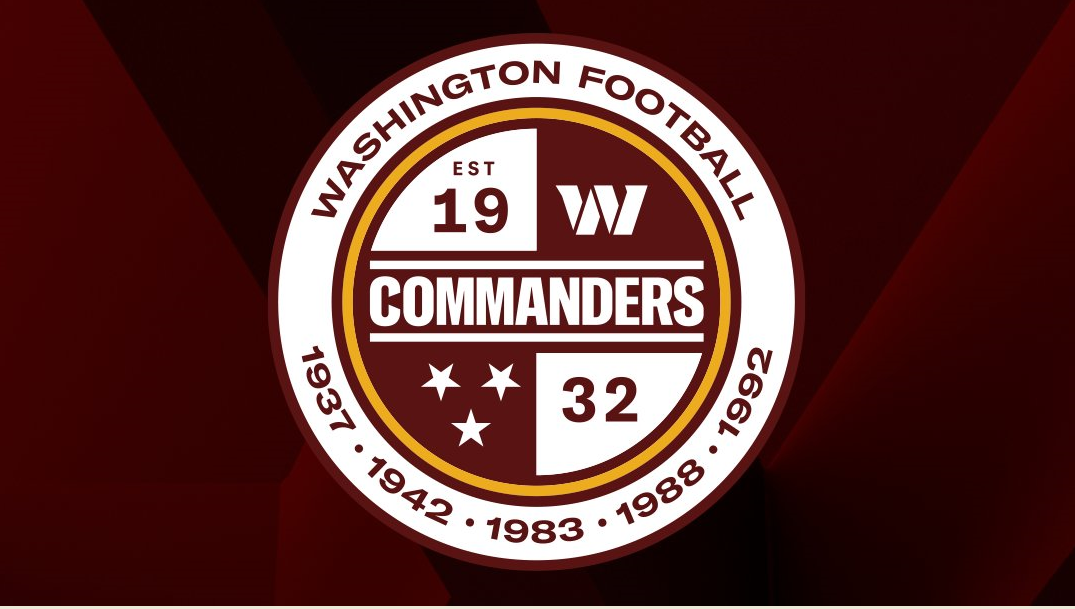
- I’ll always see the Tennessee state flag every time I see the roundel that includes the three stars. I dislike breaking up 19 and 32. They should’ve been on one half of the circle and the logos on the other half. It’s interesting the team decided to commemorate the calendar year the team won its five championships rather than the seasons. It was a smart choice not to use the moniker of “The People’s Team” as a leaked image had showed. That would have shown a lack of self-awareness give how the franchise has treated its employees and fans over the last two decades. 3/5
- I really like integrating the D.C. flag as part of the uniform even though they don’t play in the city. It could, in part, be the team’s way of making nice with the local government in order to help their bid for a stadium. D.C. Mayor Muriel Bowser voiced her approval of the rebrand and encouraged the franchise to move back into The District with a statement that ended with “The next chapter for the Washington Commanders should be a return to winning, right here in DC.” That could perhaps be the most positive revelation amongst Wednesday’s developments. 5/5
- Not having an actual logo of a commander is a little weird but understandable considering they had a human as their logo for the majority of the franchise’s existence. The team must’ve made the decision to play it safe and not have a depiction of a person to avoid any possible future controversy.
THE HELMETS
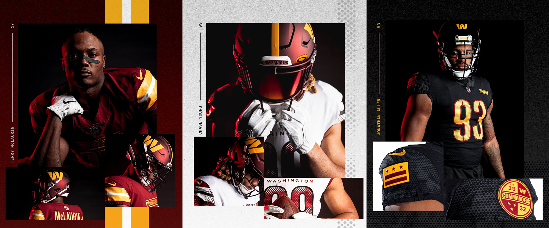
- Burgundy helmet: It made all the sense in the world to retain a burgundy helmet. I would have preferred a gold facemask but the burgundy facemask looks solid. I’m glad there’s a gold stripe because the helmet looked too bland without any stripes the last two seasons. However, they should have returned to the white/burgundy/gold/burgundy/white stripe pattern they had as the Redskins. Having a W as the helmet logo is a great decision. It’s what they should have done during their two seasons as the Washington Football Team. 4.5/5
- Black helmet: Having the W on the front of the helmet and a D.C. flag on the back is an interesting touch that may take some time getting used to. But it is strange they have the flag both the helmet the right jersey sleeve. If you’re going to do that, have flags on both sleeves. I’m okay with the numbers being included on the sides of the helmet as an alternate. A lot of fans liked that look during the Washington Football Team’s two-year stint. 3.5/5
THE UNIFORMS
- The white and black jerseys make it feel like they’re moving further away from their history rather than preserving as much of it as possible. Having only one of three jerseys (burgundy) look remotely like the previous sets feels like those in charge didn’t stick to their word.
- Bolded block numerals for classic teams look better than rounded numerals.
- The team didn’t do anything crazy with their pants, keeping the uniform much simpler than if they tried to match any of their new jersey patterns. I would have preferred a simple stripe pattern but I understand why they went with a blank slate and have no issue with it.
- I really dislike gradient patterns, especially for historical franchises. It’s hard to pull off for any franchise. It rarely works. It definitely didn’t this time. Bleh.
- The font appears to vary by each jersey, which goes against my preference of simplicity and uniformity.
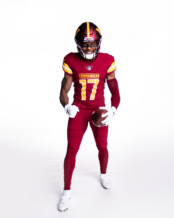
- Burgundy jersey: It’s good that they kept gold in the burgundy jersey but not as the numbers. Gold should’ve been used just as a detail like the last set. “Commanders” above the numbers is twice as big as it needs to be. I get they’re trying to match the width of the numbers (same with “Washington” in the white jersey) but they didn’t need to do that. I like the simple, solid shoulder stripes. Really dislike the mesh design with the numbers. The fact that the other two uniforms don’t resemble the past uniforms make the burgundy and gold pop more in this primary set. 4/5
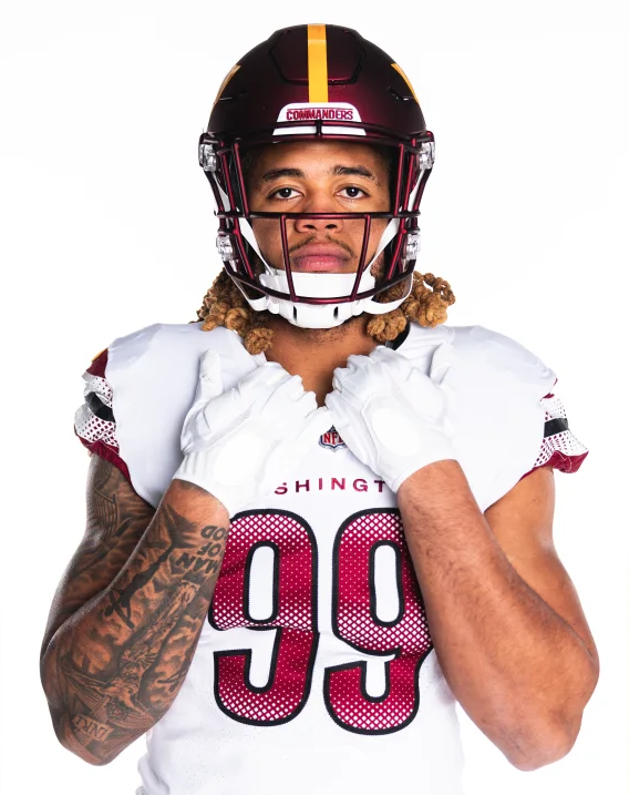
- White jersey: This set reminds me of the Falcons. I like red and black as a sports color combo, but not for Washington. It doesn’t look like the same franchise. I would’ve stuck with gold outlines and stripes and kept the black strictly to the alternate. Huge thumbs down to the lattice/gradient designs on the sleeves and numbers. 2/5
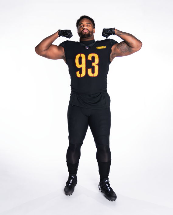
- Black jersey: I do like the idea of having a black alternate but it feels like they copied and pasted the black Steelers jersey. I like the “One Mission” moniker in the collar. Not a fan of the sleeve designs. I like symmetry so having different logo patches on the sleeves is a bad look, even though the logos themselves are nice. 3/5
- It’s notable, to me at least, that in 2012, Ron Rivera’s second year in Carolina, the Panthers debuted their black-on-black look. A decade later and Washington will debut that look for the first time in franchise history. Rivera has consistently worn black in his two seasons as Washington’s coach.

Jake, you told me everything I needed to know (and probably more) about the new name and uniform.
Thank you, Frances! That means a lot.